Yokoso
Corporate Identity
A corporate brand identity for a new multipurpose event and conference complex in Osaka, designed by architecture firm Fender Katsalidis.
The Challenge
New multipurpose event and conference complex in Osaka, designed by architecture firm Fender Katsalidis, required the creation of its Corporate Identity and whole set of brand components.
The Idea
The city of Osaka developed throughout the centuries as a centre of economy, industries and world trade; it is a competitive, safe and friendly city, as well as being famously regarded in Japan as the “Nation’s Kitchen”.
Research into factors that could support the brand identity creation developed in the core brand values of avant-garde, inclusivity and thriving, values that were then considered within the brand name and the whole visual identity of the complex.
The Solution
Yokoso, which in Japanese means “welcome”, was chosen as the name for the new multipurpose event and conference complex, to represent a new blooming, wholesome cultural hub.
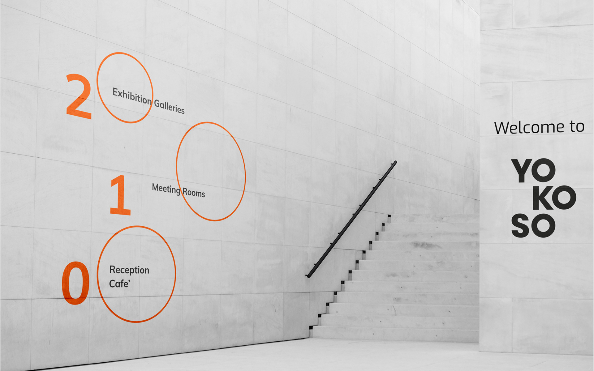
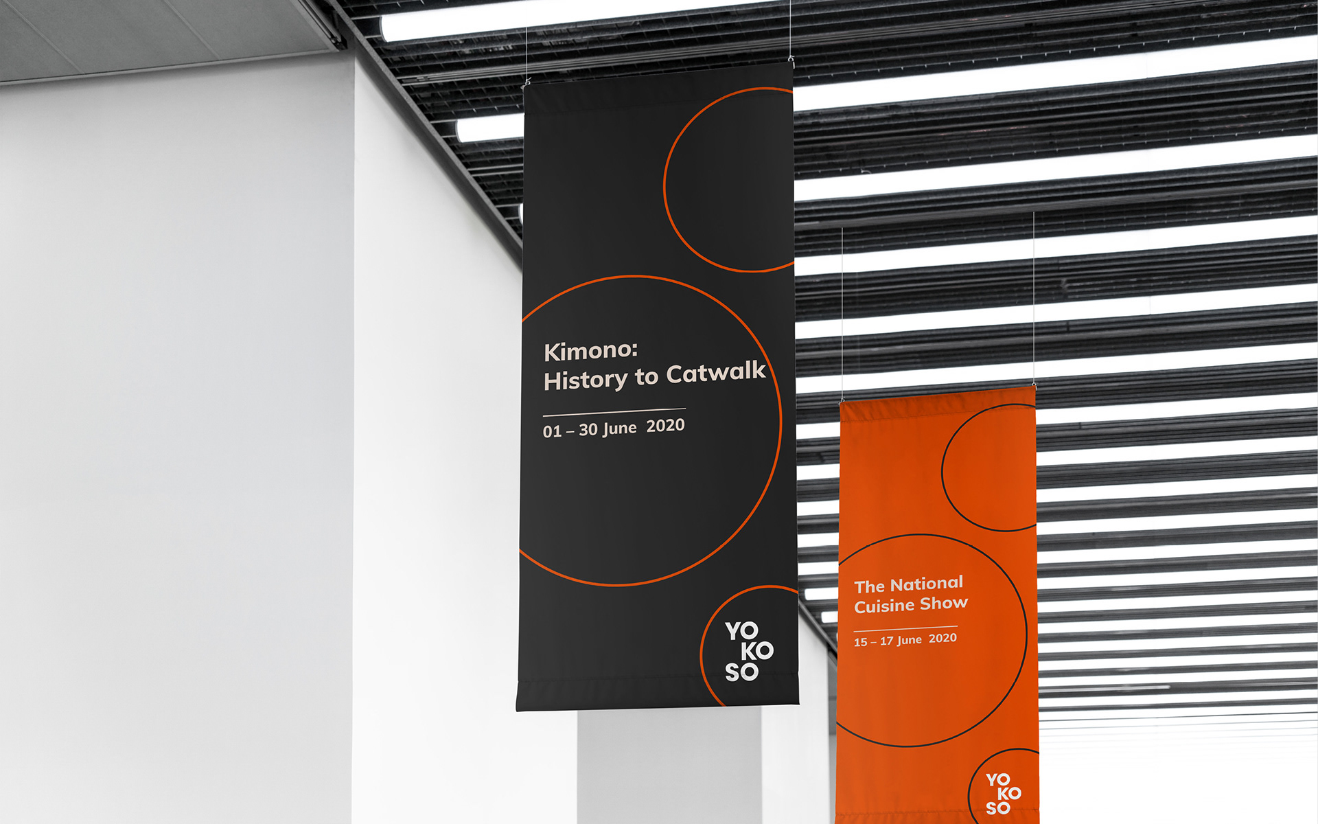
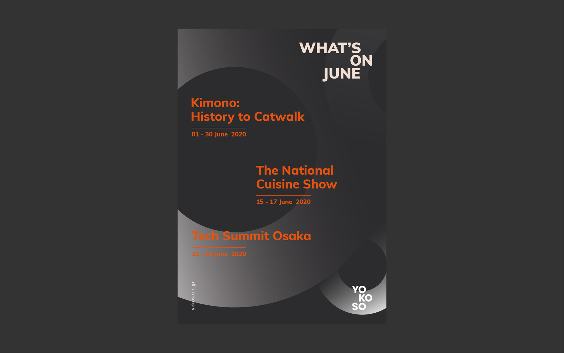
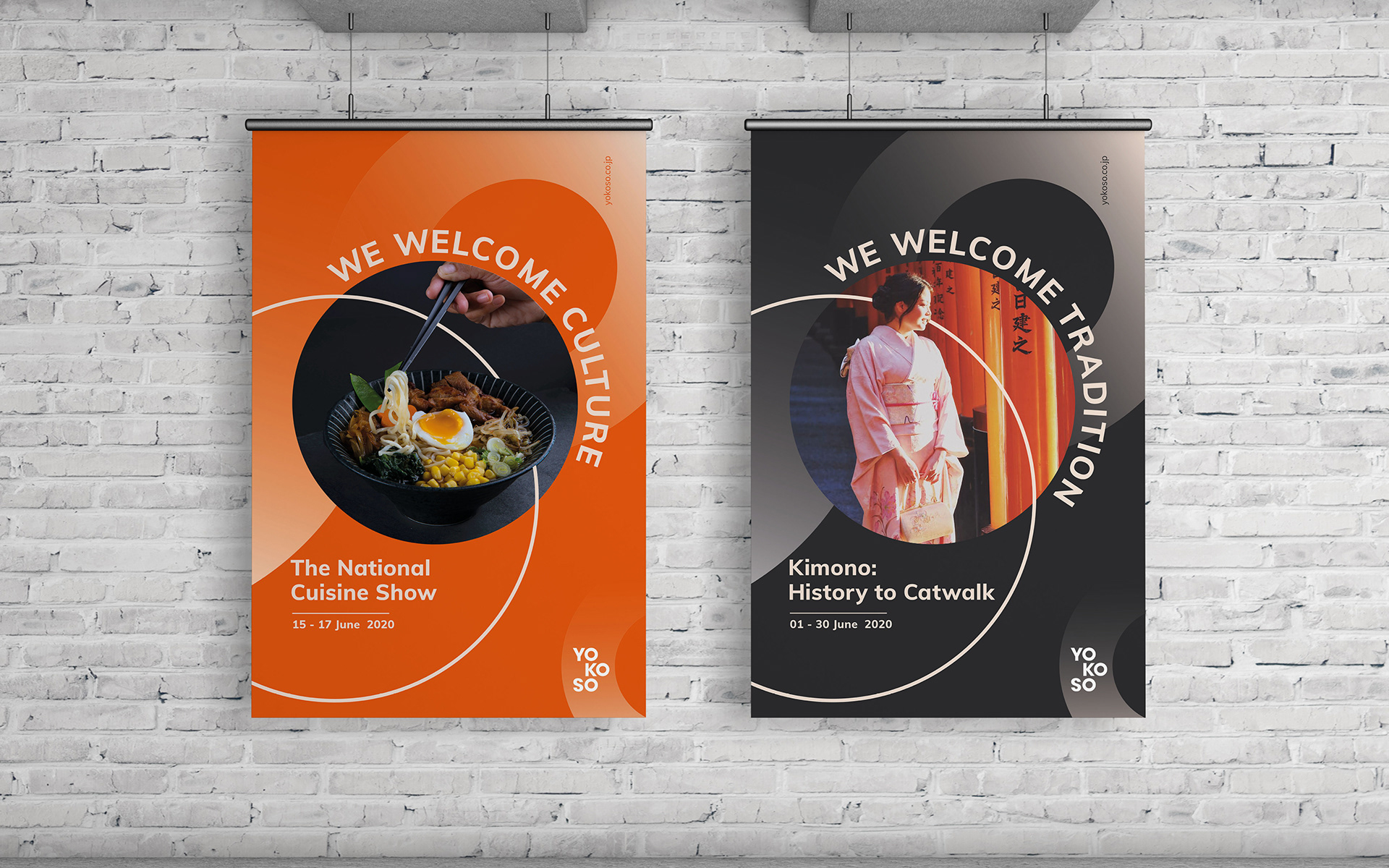
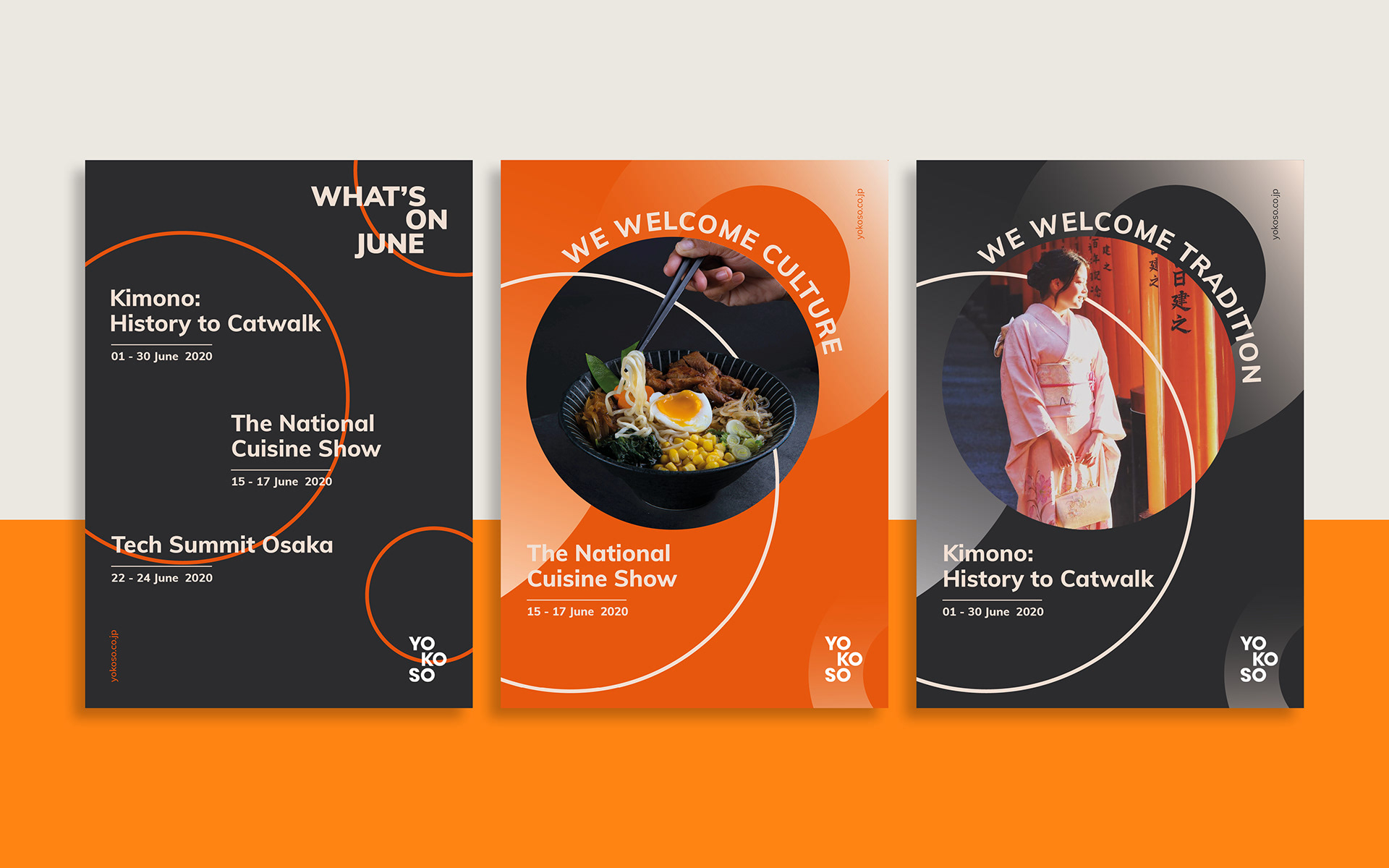
A series of circles, which came from the three Os of the brand name Yokoso, are the graphic elements used throughout the whole design to illustrate movement, adaptability and inclusivity of the brand.
The orange colour is evocative of Japanese shrines and it encompasses the meaning of courage, happiness and good health.
Sans serif fonts were preferred for the identity in order to offer a contemporary and adaptable look and feel, allowing for the messages and images to take centre stage in the designs.
