Nonna Vanda
Packaging
Story based brand identity and packaging design for a toothpaste product.
The Challenge
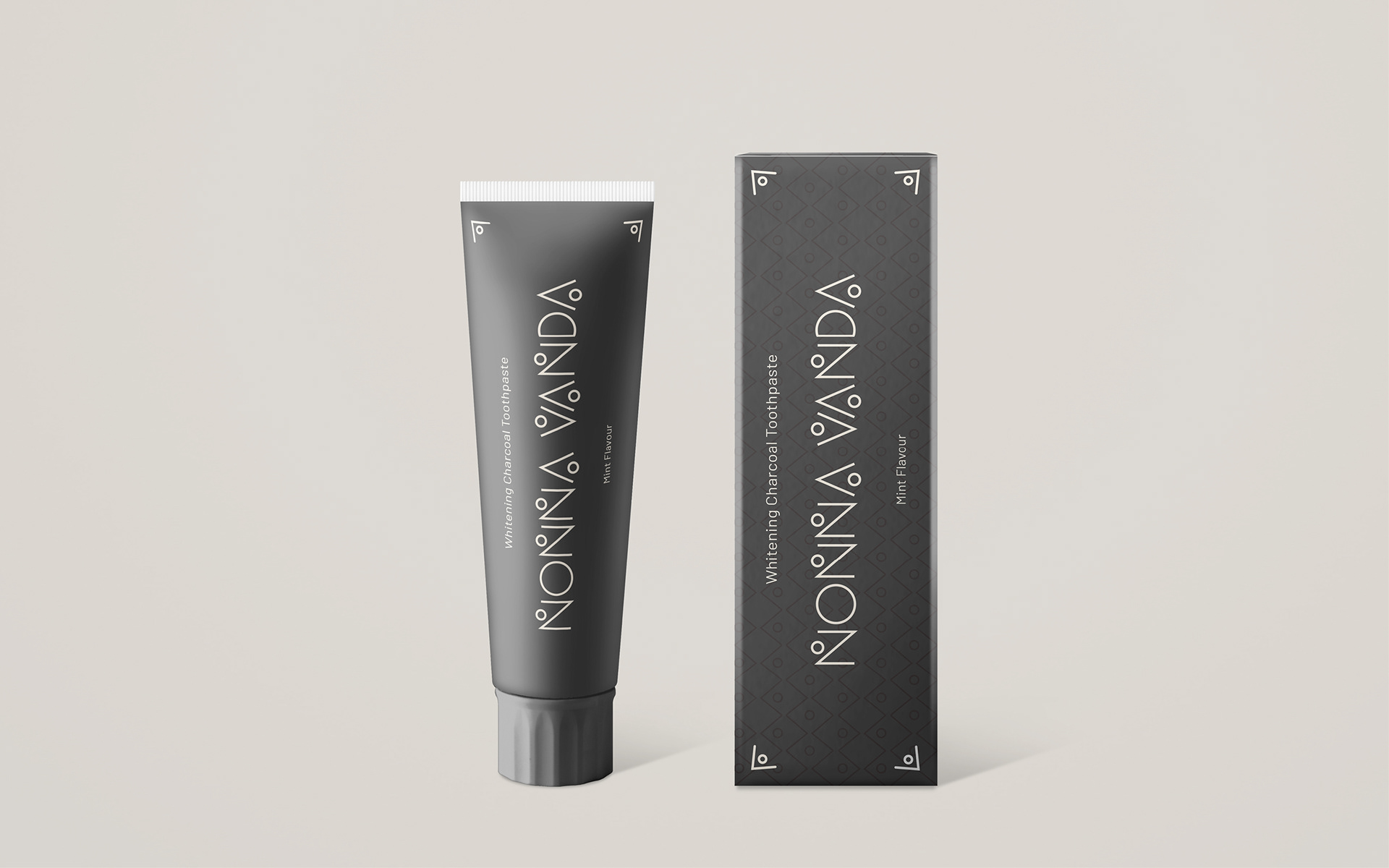
Nonna Vanda is a toothpaste brand that believes in the power of traditions and nature, that the modern can live in the respect of days past, that from Grandmothers’ tales we can build real stories, stories that would smile at us and make us smile.
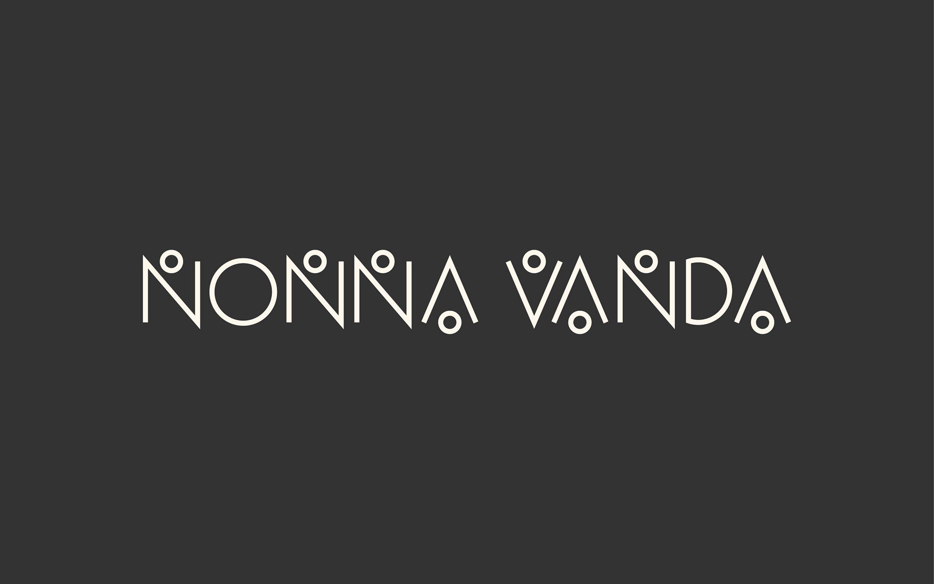
Nonna Vanda is a story based brand that required the entire design of its toothpaste range, starting from its logo to its complete brand identity.
The Idea
The brand name Nonna Vanda is an homage to creator’s Grandmother and to the tales she used to share with her when she was little.
The range of toothpaste was created with the idea of respect for traditions and for Mother Nature, using only natural ingredients. Inspirations for the design of the brand and the packaging are heavily rooted on the story location, Sardinia, Italy. Sardinia is an island with a strong identity, with a culture that strongly respects its traditions and with its own design identity.
Furthermore, a clean and contemporary look was thought essential for the brand, to best represent its values.
The Solution
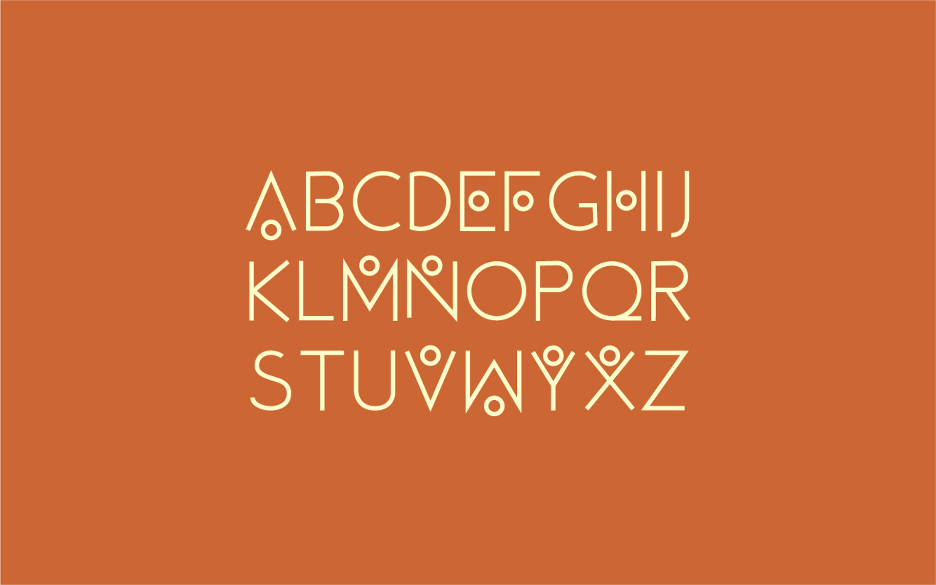
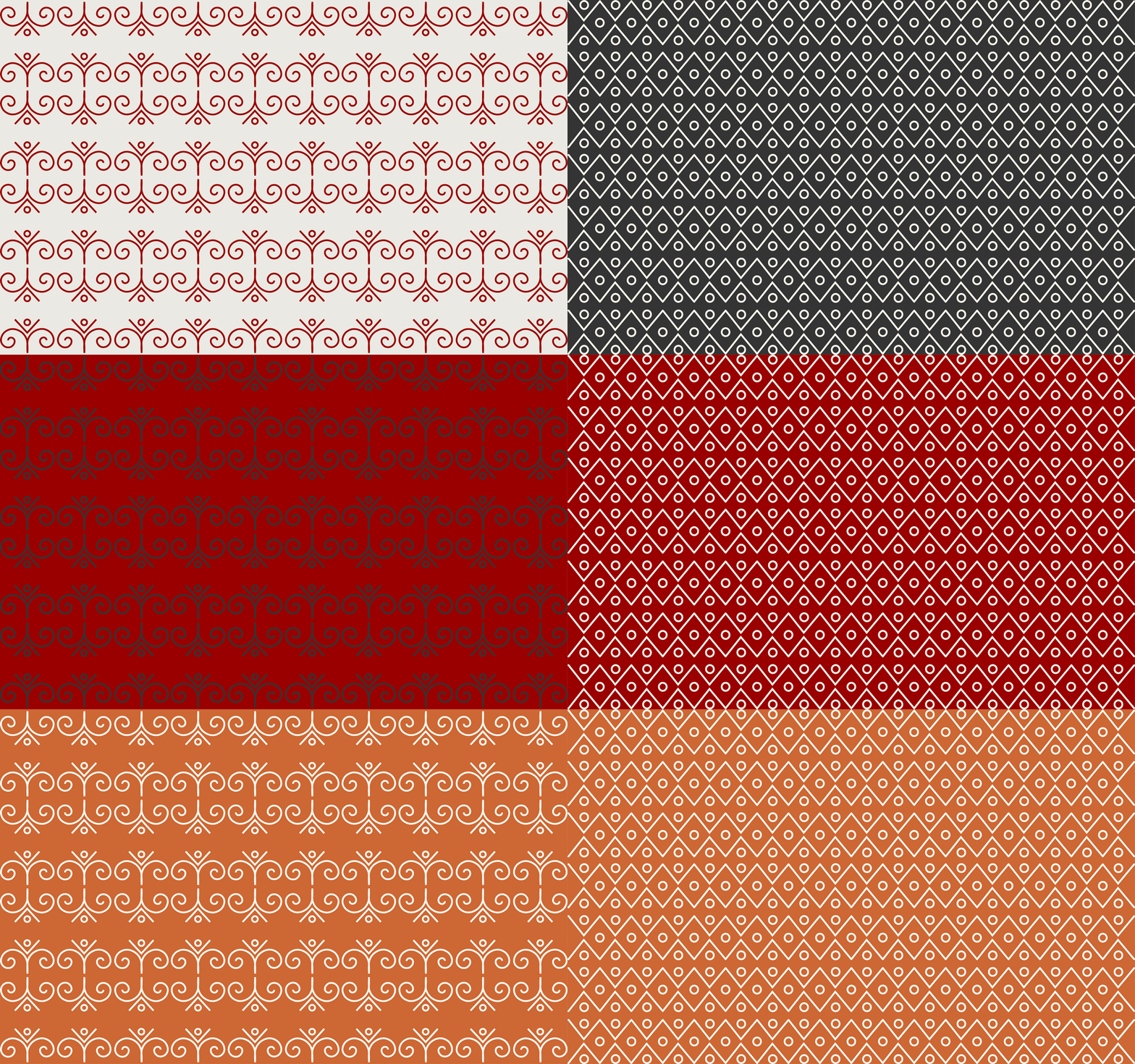
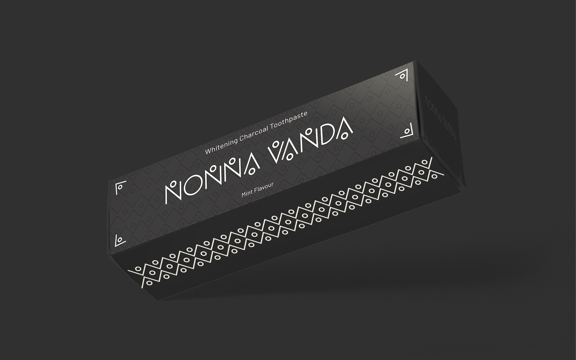
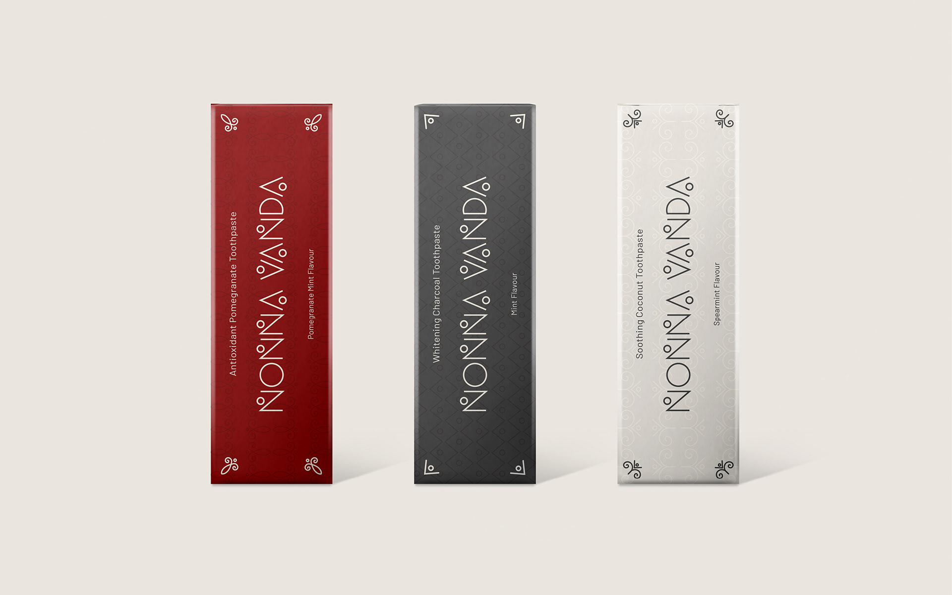
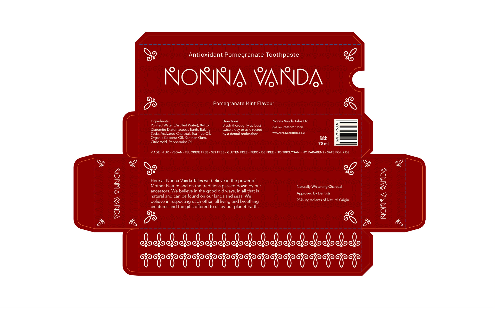
The visual identity for the brand was strongly inspired by the location, Sardinia and its traditional designs, found on ceramics, tapestries and folkloristic and traditional clothing. These are represented on the packaging backgrounds, where geometric and flowery details recall those typical of Sardinian designs. These same elements are also used for the creation of a customised font for the Nonna Vanda logo.
The brand relies strongly on simplicity, on minimal and simple details, represented on the packaging and the logo design.
